
TASK 4: AUDIO VIDEO DISCO
Last week we had some vague tasks. This week we are gonna go even more VAGUERERERER! Ok it’s not that bad but still, this task will all up to your interpretation once again. For this task we have picked four music videos. You have to watch those and chose one. You have to make an outfit inspired by the video. That can be anything! You can base your outfit on the aesthetics of the video, the feel of it, even the song. We have prepared 4 sets based on scenes from each video. Choose wisely and do your best. You are all top players in this game and I don’t want you holding back on us. Here are the videos:
David Kanaga - Space Ox & Peking Duck
BLΛNK BΛNSΗΣΣ - ECO ZONES
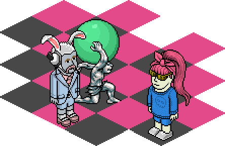
Murlo — Into Mist
Hannah Diamond - Every Night
As you can see they all vary in styles and aesthetics. We go from neon rave gay club to virtual eco paradise to Greek statues to diabetes. The only limitation this week is that we want you to be somehow relevant to a video/song. The sets look like the videos so we want you to be part of them too. If you wanna make this more “realistic” let’s pretend you have to design the outfit for the artist who’s performing in that set. That’s just one way to take this task though, good luck.
Panel
Bradley

Andrew: When you told me that you were designing an outfit that you thought would impress me, I got excited, but now I’m looking at your end result and it’s distinctly average. Although it lacks that wow factor in my opinion, it still has a good note, I can see the movement inspiration coming from the neon patterns and shapes all over the outfit, especially in the pose I caught you in. this outfit doesn’t bowl me over with sheer awe, but it’s certainly not a bad outfit by any means. I sorta wish that you would have gotten more inventive with structure in this task, because I have yet to see something like that from you in this season.
Bri

Andrew: To look at this outfit, it would seem as though it would divide the viewer’s opinion of it straight down the middle. It’s so simple that some might argue that it lacks substance. My opinion of this outfit falls on the side that adores it. The simplicity boosts the detailing in the paint splats to a whole new level. They are definitely the focal point and are not confused in the composition one bit, because they are the only thing in it! The concept matches with the video, and is also kept to a simple style, which was a great way to go with this task, since there was so much visual imagery to deal with. One thing I would say is that a black base would have hidden the lines and created a more uniform silhouette, but it still looks great with what you’ve done here. Good job Bri.
Arber: I honestly really like this outfit. I can easily see the part where you drew inspiration from and you made it quite minimal with those hints of neons popping. I’m glad you finally started toning the maximalism down and just used what you need and nothing more. I think removing the scarf and keeping the top as simple as using the jacket only would have been nice, maybe. It still looks great this way, great job.
Calum

Andrew: This outfit is giving my wafts of resort luxury mixed with virtual-glitch avant-garde. This is exactly what your chosen video exudes, and you did well to match the tough combination, so well done. Using orange and blue, colours at opposite ends of the spectrum was a good idea because it both somewhat encompasses the colours in the video, and gives a fresh tropical feel that I really dig. The mask under the hat was a nice touch as it adds an element of robotics to the look, which was also totally relevant to the video you chose. Great job dear.
Arber: I really really like this. The colours are muted yet the red pops out from the blue and the little details with tan and aqua are really well thought through. It gives you this impression of a virtual glitchy ambient. I like that the shoes, socks and skirt are all white. It balances the blues and greens in it really well.
Casey

Andrew: I have mixed emotions when I look at this piece, I really want to like it, and for the most part I do. But I can’t shake the feeling that you missed a trick when you were thinking things through with it. Your idea was great, the pink and teal work well together, the necklace from this angle cuts the rainbow flawlessly so it looks like a fade of pink into the teal shirt. The bandana compliments the necklace but also gives the outfit a hard edged survivor dimension that I really like. My problem though is that the dark leather jacket really throws this delicate colour balance out of whack big time. The jacket really hinders it and makes me want to not like that outfit, which is a great shame. An electric pink colour would have worked 100x better, Disappointing…
Arber: The angle this shoot is taken enhances the outfit. The way the spiky necklace cuts through the multi-colour graphics happening on the inside is a great decision. I love the blue overall too. What confuses me though is that jacket. That brick colour doesn’t really do anything for the rest.
Fiona

Andrew: This is great, I can see a broken-up composition yet an outfit that is cohesive from head to toe. The pink and blue feel like they’re running all over this outfit, even in the places our eyes can’t see, which is wonderful when you set it against the black details here. The black details also fit the theme of the video when you take into consideration that the girl dies of a sugar overdose in the end. Like everything you design, this is another off-beat idea executed to a really high standard, well done.
Arber: Always the odd one out, always the hipster. Yet again you are a lone-wolf on this task. There is something inventive about this outfit that you can’t really put your finger on. The way that blue is flashing on the pink is really fascinating to watch. It reminds me on the Disney movie sleeping beauty when those fairies fight over the color of the dress and end up making a blue/pink dress. The way the black jacket is laid out it looks as if the black cloth is tied on the front. Great work as always Fiona, a warning though. I think you should lay off black for a bit. You use it too much.
Joe

Andrew: I cannot explain how amused I was when you and Brad found out that you made outfits off of the same concept AND that you almost ended up looking identical. My grin was so big! The colours really pop in the composition you’ve used here; I like the bulkiness of the jacket and the skirt, looking like edgy street fashion, the black pieces really frame it too, with the tiara being the star of the show because I had no idea those two items blended so well. You’ve taught me something with this outfit, so well done. I want to see some you switch it up next week, because I feel like you’re falling into a definite pattern, and you’re becoming predictable.
Arber: You and brad really look similar but quite different too. I love that you went minimalistic with this… well kind of… that shirt is too overcomplicated to be called minimalism but the tones and shades you used tell me otherwise. The colour choice is smart and it enhances the outfit. The hat piece looks great with the tiara dot and I Love what’s going on the shirt there. Keep it up.
Juliet

Andrew: Juliet, Juliet, Juliet, where for art thou your coherent, clear concept!? Ok so I’m kidding, I can see where you were going here, Harsh black with neon flashes to represent such a seizure inducing video. The problems start when you start picking the outfit apart; For one, I don’t think you’ve really thought about how balanced the colours are in the outfit, or the fact that none of them are really pleasing to the eye when you combine them in the way that you have. There is just too much to take in colour wise. In terms of items used, they do nothing to elevate it, the goggles seem slapped on, and I dislike them used in any other way other than as part of a mask. This outfit leaves a me with a vibe of Project runway noob and a bitter taste in my mouth. You’re so much better than this! I just wish you were constantly at the skill level that we saw week 1.
Arber: I am not that impressed with this to be perfectly honest. I see your point of view with a blank canvas and popping it up with various colors from the video but it just looks like a club outfit embodied with random neons. it lacks composition. I think those giant glasses don't help at all. They kind of draw attention from everything else and they don't even look good. i think if u would have made a part of the badge black so we wouldn’t see it as an actual badge, would have helped a lot with the colour balance.
Savon

Andrew: I see luxurious sandy beaches, and clear tropical waters. Too bad I also have a run-of-the-mill party/office/street/basic flavor with most of the items used here. As you’re a skilled designer you’ve obviously executed the technique well, but such a how-to-basic looking base outfit REALLY hampers your chances to succeed. I will say though, that the texture on the shirt with the teal blue is a stunning combo, I just wish this compliment applied to the entire outfit, because it’s honestly below average. This outfit is going to leave you coasting at the back of the back, if you don’t get eliminated that is.
Arber: Savon, man what the hell… This outfit is really basic when it comes to this casts standards. I feel like you’ve given up. I can see the literal inspiration from the beach, the sand and the water but it really doesn't look inventive at all. I really don’t know what to add to this. The scarf looks out of place, the shorts and that belt don’t match together. The shirt texture is nice though. The gray part of the outfit is ok as far as it goes. You really need to bring your standard up if you make it this week.
Vicky

Andrew: Much like Bri, you’ve taken a simple concept and executed it to such a high standard. This outfit is so packed with pattern and I absolutely adore it. I don’t even care if it looks a little basic when you think about the items you used, you covered for that tiny flaw with amazing detail. The white cuts the green nicely and gives me a mixed avante/luxe/punk feel that I love to see in outfits. This is probably my favorite outfit of the week and for good reason too. Honestly wasn’t expecting you to step up so far in this competition Vicky, I’m a fan after this week, good job.
Arber: I can see that Vicky isn’t willing to give up her top spot so easily this week. I love this outfit. The concept is so simple and the outfit is basically done in the same simplistic manner but damn it looks good. I like that you didn’t stop with the whole graphical side of the outfit at all from top to bottom and them to clash the repetitiveness of it you added the graphical white belt and white shoes. That was a really smart choice. keep it up dear.
Arber: I honestly really like this outfit. I can easily see the part where you drew inspiration from and you made it quite minimal with those hints of neons popping. I’m glad you finally started toning the maximalism down and just used what you need and nothing more. I think removing the scarf and keeping the top as simple as using the jacket only would have been nice, maybe. It still looks great this way, great job.