
Congratulations for making the cut and becoming part of this long-term. Before we continue with the first task we would like to share some suggestions and rules with you:
-Please add Issus & icearbr to see when we are online, this will make submission of your entries for the week much easier.
- When you start this game the gender you pick is the gender you will be stuck with. The same goes with skin tone and face. Whatever skin tone and face you pick you will be using till the end. This doesn't mean you aren't allowed to use clothes of the opposite gender as long as you still keep the same character throughout the whole game. For now you are free to use any hairstyle you want. Later in the game you will be assigned makeovers which will include a hairstyle and haircolor that you have to keep for the rest of the game.
- We would like you to follow the task during the timeframe we allow. We will still accept submissions after the date on which it is due, but the late submission will be reflected in your placement for the task and in your feedback (this of course will be overseen if you notify us before hand.)
-Respect your competition and don’t forget to have fun, it’s a game. The cast we have gathered is strong, so don’t be ashamed if you bomb out of the competition early.
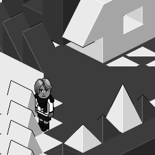
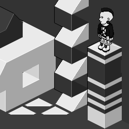
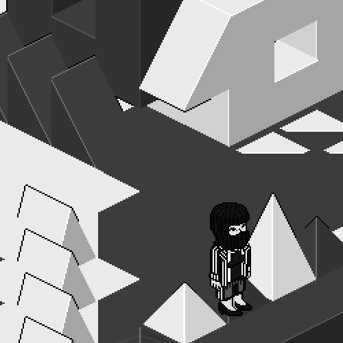
TASK 1: BALANCE

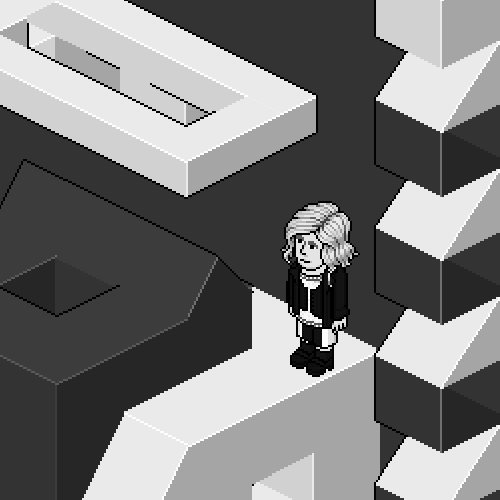
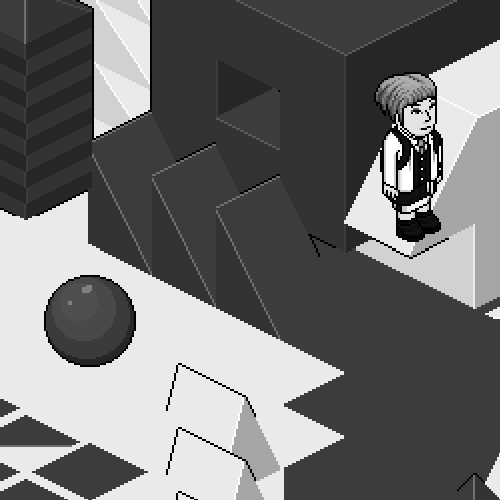
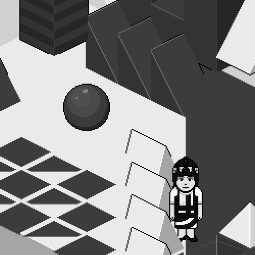
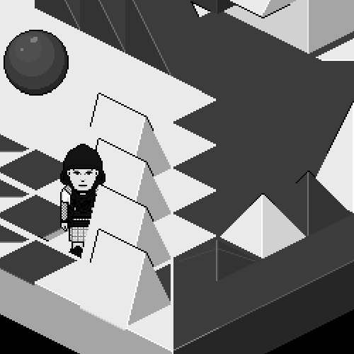
For your first task we want to start simple, test you before we move onto more challenging tasks. For this week we will be doing black & white. That’s right; we want you to create an outfit using only the lightest shade of white and the darkest shade of black, NO NORM GREY SHADES. Mix and balance the two. It should go without saying, but try and create something fresh and new; you’re all capable of it. Composition and structure matter a lot on this particular task, as you can see from the sculptural set we have prepared for you. It’s a pretty simple task to start the competition, but since you’re all skilled individuals, we’re expecting a greater understanding of it from all of you. We are going to be editing the photos we take into black and white, so skin tone and hair colour will not matter this week. We suggest that you see how your outfits look in black and white, before submitting.
When you’re done with an outfit you like, message icearbr or Issus and we will take you to the set to take your photo. That photo will be what we use to evaluate your outfit and give our judgment.
The deadline for this task is July 20th. Please try to submit your outfits before then.
Week 1: Panel
Joe
Arber: You gave us one of the simpler minimalistic outfits. It stands out among a bunch of detailed outfits. I love how crisp the detail looks, the contrast between black and white is quite clear and that's one of the things i like the most about this. My only problem is the undershirt you used. it's too soft with the hard looking exterior of the outfit. I wish you’d pick something more sharp for the inside. Overall it’s a great outfit and I’m glad you’re part of this cast.
Andrew: As a first impression for the long term, this is a great outfit. You kept all the lines clean, which is a great aesthetic to keep in this task. I like the detailing you’ve used in the jumper/sweater, which is especially great because it’s often something people try to hide when creating a crisp outfit. You’ve also created a great balance between black and white, and were able to use those shoes without making them a dated addition to the outfit. Overall, there’s really not much I can pick out as bad in this outfit, although it’s somehow not as exciting as I’d hoped from you and I really can’t explain why I feel that way, I guess it’s because you’re a rushed entry, In any case, well done on a solid outfit.
Brad

Arber: The top I LOVE. The way it’s textured and the amorphous shape of it makes it look really couture and elegant. My problem though, is the bottom. I feel like that particular skirt was the wrong choice. I think using block pants or a simple blank long skirt would have made it better. All in all it's an eye pleasing outfit with a great composition of contrast.
Andrew: To agree with Arber, I feel that the top half of this outfit is really well executed. The textures match and you did a good job of hiding the bulk of that gigantic necklace. My big problem with your outfit is the skirt. Floral print really takes away from the avant-garde nature of the top half. What’s worse is that the floral pattern in black and white always reminds me of cow print. Other than that, you did a good job of balancing the black and white. I just wish you would have used the kimono skirt with the triangle pleats; it would have meshed with the top half a lot better.
Bri

Andrew: At first I wasn’t much of a fan of your outfit; I think that’s because I didn’t like the overall bulk on the top half, It seemed a little basic in terms of creating something compositionally strong, with the flat 50/50ish colour combo you’ve used. After pondering over it for a while though, I notice the clever use of the punk top bracelets to add that tiny bit of detail. It’s really not going to change my opinion of the outfit though, I was expecting a little more from you I think.
Arber: Based on new creations, that tiny detail of the bracelets with the coat which gives you those tiny dots on your arms is one of the most inventive things I’ve seen this week. But considering that with the rest of your outfit, the rest is just bland. If it wasn't for those dots you might have been the first one out in my opinion.
Calum
Andrew: This was honestly always a potential winning outfit when I saw it at your shoot. I love the layering you’ve created in a simple suit. The use of the bow belt to connect different sections of colour and create an entirely new composition is genius in my eyes. The bottom half is definitely stronger than the top as there isn’t much going on, but the bottom half alone is creative enough to get you through to next week in my eyes.
Arber: When you first look at this you see this elegant crisp tailored suit which looks quite simple but when you really look at it you find these small subtle breaks of contrast and composition that elevate the whole thing. the small specs of white that show on your bottom and the specs of black on your left sleeve along with the backpack straps turn this from mundane to high fashion.
Casey
Andrew: I really enjoy this outfit. You took the basic top+skirt+belt combo, took it apart and really thought about where each line is going. I love that the line in the top flows down into the lines in the skirt, it creates a structure that I definitely haven’t seen before. The balance of colour here is also phenomenal. the hat you used doesn’t do much for me, but when covered with the head dress, and posed diagonally I can’t even tell it’s a shitty hat, great job with that. I really feel like you took your time to think this through and give us the best you could.
Arber: I simply love this. You did exactly what we asked and imagined for this task. We wanted you to use black and white to create new shapes and patterns that we have never seen before. The ways the black lines of the top connect with the swirls of the skirt are impeccable. The horizontal lines that split them are a nice compositional touch. What I’m not a great fan of is the headpiece, I feel like the complicated patterns of the outfit need to balance out with a simple headpiece or simply just hair.
Emily
Arber: This is a lovely outfit. The pieces are thoughtful and connected quite well. I like that the black goes from the hood to the waist with a thin split while white goes around it. My only problem is the texture of white. I wish it was more connected in a way and not look like two separate pieces. Overall this is a great job.
Andrew: My first impression of this outfit was that it was bland, on closer examination though, I see that it’s structured rather well, with the headscarf leading down to the waste, giving a nice focal point and making the head more important to the outfit instead of just an addition. Although I do admit that this outfit has some redeeming qualities, it’s still rather boring in terms of shape. I think the use of contrast is what remedies this most. I think this is a mixed-bag of an outfit really.
Fiona
Andrew: Definitely not proving me wrong when I said you had a unique take on designing outfits, the use of the general jacket is very risky, but you pulled it off skilfully. The lapels join with the scarf to make some sort of extra black embellishment on it, which I really dig. The scarf also covers up most of the nasty bits in the jacket that we don’t need to see. The great top half is made the centre of attention by the simple cut lines in the bottom half, making it the star of the outfit. I really enjoyed this one, great work.
Arber: I love that you kept true to your style and gave off your original weird vibes with this outfit. That jacket was impeccable and using a simple black bottom with black shoes really balanced this outfit. I like the black shoulder pieces connecting with the black blog on the front. That black blob (scarf) is what I dislike about this. It just feels like too overwhelming and it's taking our attention away from the great jacket.
Juliet
Arber: My first comment about you when we cast you was “she will either make the best outfit of the week or get eliminated immediately” I have to say I am thoroughly impressed with this piece. It’s wacky, it's funky and overall it’s composed really well. I like that you kept the top part clean with a simply edgy haircut earrings and a black coat. Then you make these intricate details that don’t end till they touch the tip of your toes. I can honestly say this is the first time ever that I’ve liked the usage of those glasses that hang from a shirt, Great start Juliet.
Andrew: I’m in awe of this outfit, like I am with most of your outfits (whether brilliant or awful). It combines texture with clean lines and it’s actually working harmoniously. The use of the boots was a nice way to give us an area of pure white to contrast against dense textures and patterns in the top and waist. I’m going to call you marmite from now on because I feel like I have to love or hate every outfit you make.
Kat

Andrew: This outfit honestly disappointed me immensely. Its main downfall for me is that overall, it’s really, really dated. there are a few redeeming qualities it has though, like the combination of the necklace and the fur scarf/jacket, blending them nicely is a good touch to the outfit, adding much needed detail to the piece. I think that the white scarf was a good idea to make a contrast and balance in the black, but there needed to be more white in the other items in order for it to work to full potential.
Arber: Honestly, I don’t find this outfit as strong as the rest. This is a talented group and you have to be on top of your game to keep your head above water. This is not the time to play it safe, and I feel like you played it too safe this week. let’s start with things that I like. The balance of the colors is done well, doing a messy middle while keeping the rest black was a smart move. Where this misses the spot is the articles you picked around it. That hat doesn't do much justice to this outfit. The punk rock bracelets look so out of place with this and I feel like the hanging cardigan sleeves that you used just aren't bright enough to make this outfit POP.
Mike

Arber: Mike, I expected great new inventions from you. I know you have it in you because I’ve seen some stuff that no one even thinks about creating. But this outfit is a bit of a disappointment. The shirt inside is done well with the weird black and white design and the belt. What I don’t like is the choice of jacket and skirt. They just feel disconnected in a way and kind of make the outfit antipathic. And please let this be a message to all of the designers, if you think “oh i should maybe add a veil…” Don’t. Veils never work for me.
Andrew: This outfit is not as unique as I’d hoped from you, I can remember seeing a lot of very experimental things coming from you, and this just looks dated. The jacket in white really takes away from the great detailing in the under-shirt; black would have framed it nicely. This skirt against the jacket looks grey in any way you look at it, even when coloured in brightest white. This gives me a vibe of it being faded and dull, which is not good in this particular task. I find the hat and shoes cliché, but the pop that they give makes them passable. I don’t really know what else to say, it’s a very middle-of-the-road outfit, if that.
Savon

Andrew: This outfit, as with most things you design these days is very polished, and executed expertly down to a T (mostly). You’re the only designer that has chosen to show skin in this task, and I think it’s paid off for you. I find this outfit refreshing in that it plays with cuts in the clothing more than the colour balance. I think it works because of the skin tone you design in working great in black and white. The bow belt seems a bit much, like you crammed it in to add detail when you really should have kept that area simple with a norm clip-belt. That’s my only real gripe with an overall great outfit though.
Arber: This is a nice outfit. It’s light and edgy and overall sexy, surrounding it with black while doing white details in the middle was a great compositional choice. It’s clean, it’s crisp and it’s quite the attention grabber. Let me tell you a secret. I noticed you wearing something I presume an outfit you were working on for this week. If you would have keep that style with the flowy white fabrics and adding some crisp black details it would have been one of the top outfits this week.
Vicky
Andrew: In my opinion, this outfit is a prime example of a great idea that is executed badly. I really can see where you were trying to go with this, looking at your outfit, it’s clear to me that you studied the task and the set and came to the conclusion that we wanted something artistic, rather than street. The lines in the mask, the jacket and the shorts all link the outfit together, but that’s where my understanding stops. Where Arber sees a cross, I see a cloud that was not used correctly. There is a much better way of creating a cross composition, using a belt. The balance of black and white using stripes is simple yet effective and keeps me from bad mouthing the outfit entirely. If you don’t already have the purchasable clothes, I suggest getting them because I feel like it really hampered the potential in this outfit.
Arber: I really loved this outfit. It was well thought out. The highly graphical jacket and the way you connected it with the lines on the pants was a great move. The cross in the middle was also quite refreshing. I gave this outfit a high score even though I feel like the mask was a bit too much, It kind overly done with the mask. I wish you took that off and kept a simple hairstyle to balance it out. I mean the name of the task was BALANCE.