
Task 2: PLANTS STARTS AND MOANS IN SPICE

The concept of this task is quite simple yet “far out”. As you can see the set is just a (pardon my pun) blank space. You have all been randomly assigned all 9 planets of our solar system (yes Pluto is still a planet, I don't care what the scientists say) + the moon and the sun. We want you to get inspired by the planet / moon / star you’ve been assigned and utilize that in your outfit. We suggest that you study your planet, find details about it such as its atmosphere content and gravity intensity etc. Don’t just look at its colour and go off of that alone, actually think about it, we’re looking for you to use this concept as a springboard for your creative imaginations. The planets are assigned as follows:
Mercury – Joe
Venus – Emily
Earth – Bradley
Mars – Fiona
Jupiter – Mike
Saturn – Casey
Uranus – Savon
Neptune – Vicky
Pluto – Bri
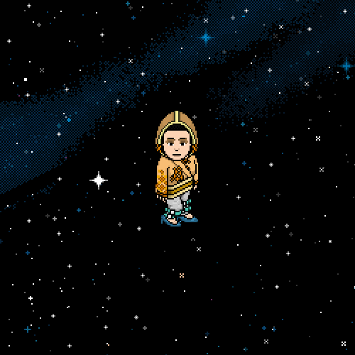
The Sun – Calum
The Moon – Juliet
For this task we’re looking for some bespoke runway couture so steer your outfits in that direction, be as creative as you feel is necessary, because you’re not going out in public in these outfits! Doing it this way will give you a wider scope for experimentation and pushing your creative limits, instead of having to keep to something practical and wearable. Again, don’t hesitate to contact us if you have any questions about the task, we’re happy to clarify details with you.
Panel
PLEASE READ: We would like to inform contestants that our eliminations are based on an average score that is produced by taking the mid-point of our scores for each outfit. Obviously, lowest average score loses. the scores arent what's important though, since you know where you came on the board for the week already. It's just how we figure it out behind the scenes. Doing things this way keeps things fair as our opinions vary a lot and it also keeps tention up since we have no idea who will be going home each week in such a close run cast.
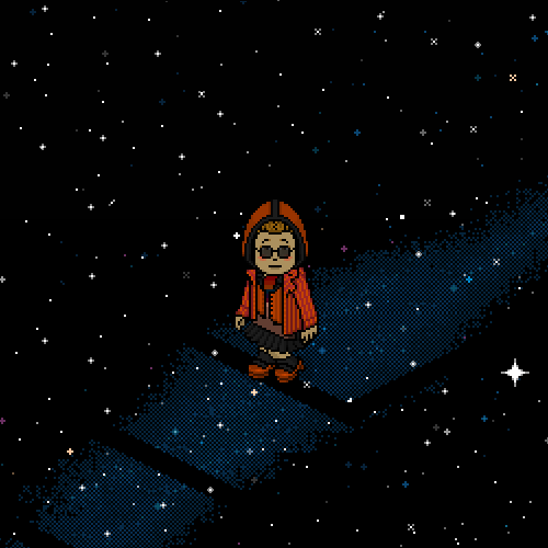
Joe - Mercury

Andrew: Being the planet closest to the sun; you’d expect mercury to be devoid of life, a desolate unforgiving place. This outfit gives me all of that, wrapped up in a stylish package. This is the most appropriate use of the gasmask this task, and the orange detailing on the torso does well in balancing against the blue hair we gave you. It’s a great outfit that really speaks of you understanding how to take a concept and communicate it visually without confusing the viewer, Well done.
Arber: The explanation and the concept of this outfit is really simple yet done amazingly well. I love the whole representation of a scorched dry surface with great heat stuck inside trying to get out. As I’ve said before the simpler the concept is the better the outfit will be. The outfit works well with your blue weird hairstyle you chose and keeping the same shade of gray with small changes throughout the outfit makes the red in the middle really pop! The only thing I don’t particularly like are the pants you used but comparing and mixing that with the rest of the outfit it looks like they belong there. Great job Joe keepz itz upz.
Emily - Venus

Arber: Let’s start immediately with what I don’t like. Venus is basically the brightest planet in our solar system. That whole “holy” lightness gives the planet the femininity it represents, yet you gave us the darkest outfit of the week. I really wish you would have used light tones to represent that purity the planet has. Anyway even if it’s dark, it’s still very feminine and edgy. I like that you went for a swimsuit like outfit representing the scorching heat in the planet and the hints of pink representing the mythological aspect of the planet. Even if it’s not the obvious choice of reference, I actually like how your mind works and what you did with this.
Andrew: This outfit is very clean cut to me. Your choice to design an outfit that would show off womanly curves was a great one. You clearly based your colour palette on the planet itself and not the roman god of love, which is totally ok, although it does take away from the feminine connotations that come to mind when you think of Venus, the hot pink stripe really wasn’t enough to recover that detail of a concept in my eyes. The cloud was a great way to add a twist too this otherwise generic outfit. This outfit layout probably would have worked better with less heavy colours. The small details fail to elevate a pretty simple outfit in my opinion though.
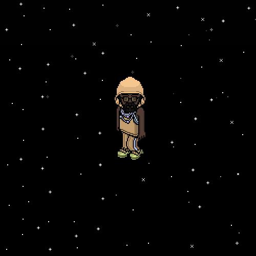
Bradley - Earth
Andrew: As I wasn’t present when you did your shoot, I am going to have to evaluate your outfit and try my best to understand the reasoning behind the design decisions you made. First of all, I can see that you did an extremely good job with avoiding the cliché green and blue colour pallet. I see that you went for earthy tones instead, which was definitely a good decision. The layering also fits your planet somewhat, accounting for the many forms of life on earth. The critique I have is that the outfit as a whole seems very dry… Considering that our wonderful planet’s surface is mostly water, this seems like a miss-communication. Did you add sunglasses to try and get some space age edge? Because I don’t think they work for me. It would have been nice to have your face clean and pure, almost referencing mother nature. I think the colours both helped you and messed you up.
Arber: Choosing the drier lighter tones instead of going green and blue was a great choice. I love how dry and scorched it looks. It’s an interesting concept for the earth. The multi-layering job you did is interesting and every colour you picked has a different meaning. It reminds me of a bird in flight POV of earth. Most of the time I dislike the shoulder pads but in this case they give you this really plant-like edge. Overall it’s a great improvement from last week. Keep it up.
Fiona - Mars
Arber: I don’t have your explanation of the outfit so I’ll just work with what I see. When we look at mars we see these clashes of darker red with brown and black and I can clearly see that in the layering of this outfit, which btw is amazing. In mythology, Mars is the representation of masculinity and strength and the way you used male clothes was a very smart move. I like how corlayesque it looks with the colour choice and the way it’s represented visually. This is a really strong outfit and a great improvement from last week. Keep it up.
Andrew: Firstly, I want to say… WHERE IS THE RED? I know its cliché, but when you think of mars, you think of the colour red, the closest shade I can see is some burnt orange. It lets the design down for me that red is barely present in this outfit. The straps, under-vest, skirt and hood all work great together as layers, and as a bonus, they remind me of roman armour. I look at this and I get vibes of strength, as if you were actually a warrior. Great outfit, but it would have been 10x better if it had some deep blood red incorporated into the design.
Mike - Jupiter
Arber: You had the biggest planet of the solar system which has such vibrant colours which make the whole planet look like an oil painting, yet your outfit is devoid of the detail Jupiter has. The gassy surface of Jupiter gives you these horizontal messy stripes of light brown and blue with some lush reds to work with. I really wish you would have used the all those painting like textures and give us a masterpiece of your own. But you went for this minimal 2 colour small outfit, oh well. The outfit on its own is ok. The hints of blue behind the overshirt gives you a nice detail and a clash against the simple block of colour you have on the front with the hint of the blue line going through the same shaded pants. I wouldn’t say this is an improvement really seeing how you had SO many opportunities with a planet as big as Jupiter.
Andrew: In my opinion, this is a good improvement from your outfit last week. Unlike Arber, I think that simplifying it down was a wise choice, since I really don’t see a bunch of reds working with the palette you’re already using. The outfit is as simple as the palette, and it has a fresh feel to it with all the clashing blue detailing. I really feel like this is an outfit for someone living on Jupiter, rather than an outfit personifying Jupiter, which is just as great. This really could have ended up in a mess, but your decisions in editing were good enough to keep the outfit relatively on point.
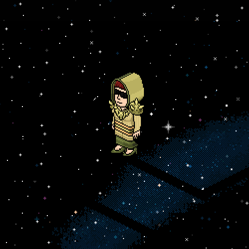
Casey - Saturn
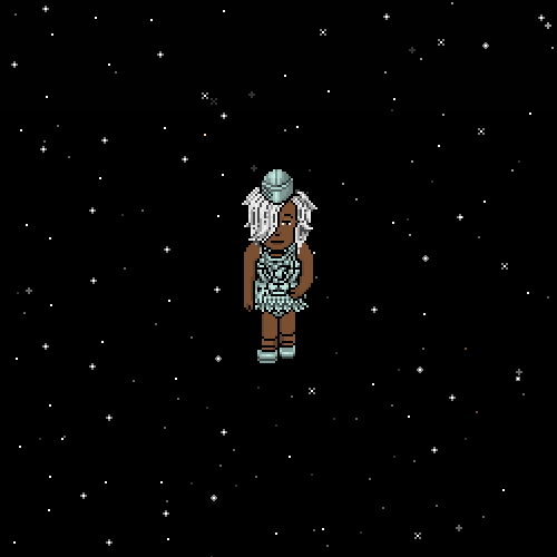


Arber: This is one of my favourite outfits this week for me. The rich vibrant colours really give out this scorched heat material whereas the mask gives it identity. I find the layering in this outfit impeccable and the hints of bright red in the middle with the black from the belt really gives you this impression of unbearable heat. You also worked well with the makeover you were given using the darker blonde colour to your advantage. Keep it up.
Andrew: I have a rather mixed opinion on this outfit. On one hand, I can really see where you were going with this. I see heat and I see charring, which is great. The layering and textures from this angle really match up to create something likening to an inferno. I think that what this outfit lacks is an aspect of the sun being the giver of life. I would have loved to see some lighter yellows and crèmes or even gold mixed in here, instead of the black. The gas mask doesn’t help this either. What it has in its violent nature, it naturally lacks in opulence and importance. This outfit missed the mark for me in this regard.
Juliet - The Moon
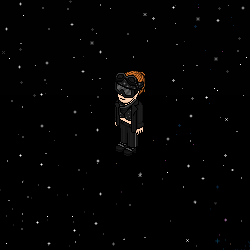
Andrew: This is a bit of a step down from last week’s outfit from you, I still enjoy it though. This choice of yours to go black is what saves the outfit, ingenious. Really reminds me of the version of the moon that you see in the videogame “destiny”, however irrelevant that point may be. The outfit itself is kind of bland to me; I like the hints of grey pattern, and the stripe, but the items sum up to a generic silhouette. The mask however, gives the entire outfit a moon explorer vibe that I really, really dig, Great job.
Arber: This representation of moon is quite interesting. You give me the whole dark side of the moon. I know the satellite you were given was a bit blank and devoid of the lushness the rest of the planets have but that didn’t stop you into giving us a well balanced outfit using only 2 colours. Still though the black kind of makes it lose the whole texture of the moon that’s basically all craters. The detail with the bra dots and the dots on the bandana are amazing. This is such a nice touch on the detail. This outfit has the strongest headpiece of the week but when it comes to the rest of the outfit with the jacket and the pants it becomes quite boring. Overall a nice job but compared to some others this isn’t the top outfit of the week.